Oakley Trophy 2020
When the Alps take shape through light and color.


When the Alps take shape through light and color.
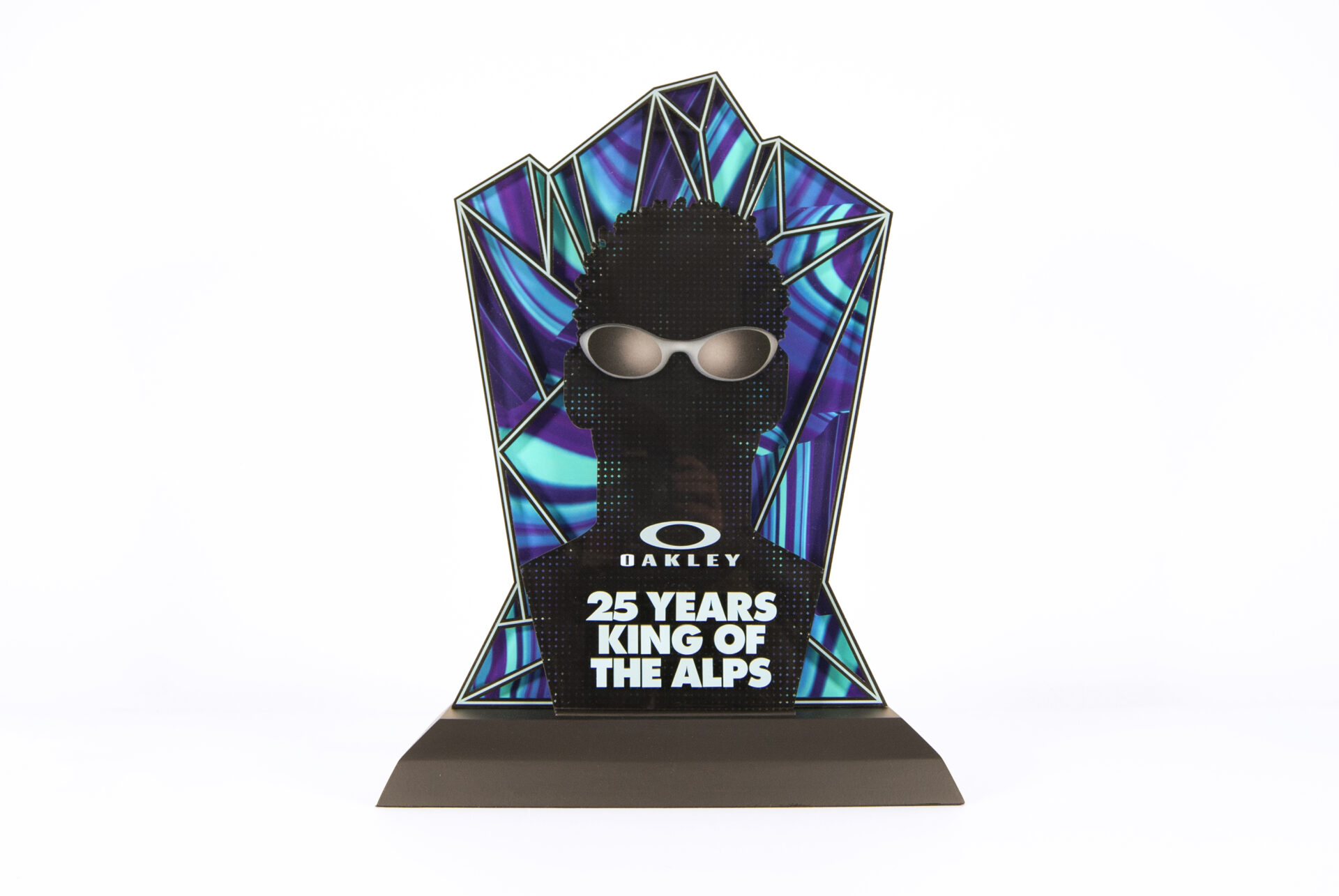
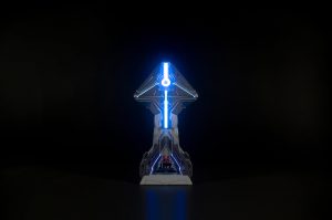
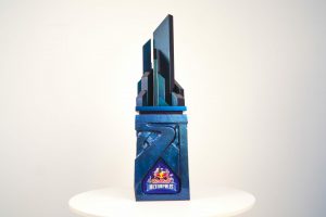
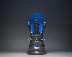
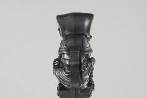
This trophy was created to recognize an employee’s long-standing commitment and the quality of their initiatives at Oakley, celebrating 25 years with the brand.
Techniques used

For this trophy, we sought to express Oakley’s identity through an interplay of light and color.
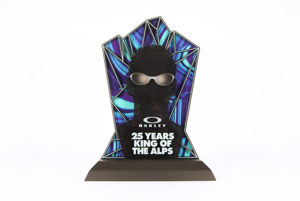
For the design, we were tasked with personalizing the piece by featuring the employee’s silhouette in the foreground, accompanied by the inscription “25 Years King of Alpes.” In the background, a graphic representation of a mountain range evokes the Alps and the brand’s outdoor identity.
To bring this landscape to life, we chose to segment it like a stained-glass window. This construction allowed us to play with transparency, color, and light, capturing and translating this distinctive visual sensation into the design.
The color patterns and gradients were created by drawing inspiration from the reflections observed on Oakley eyewear lenses. This approach allowed us to develop a dynamic palette dominated by purple and blue, two colors strongly associated with the brand’s visual universe.
Through the interplay of light and color, the trophy brings together a tribute to the employee, the spirit of the Alps, and Oakley’s distinctive visual identity.












Ready to start your project?
Visual Identity Creation
Visual Identity Adaptation
Concept Art and Graphic Design
Sculpture and 3D Modelling
3D Printing / CNC / Laser Cutting
Surface Finishing
Moulding / Casting